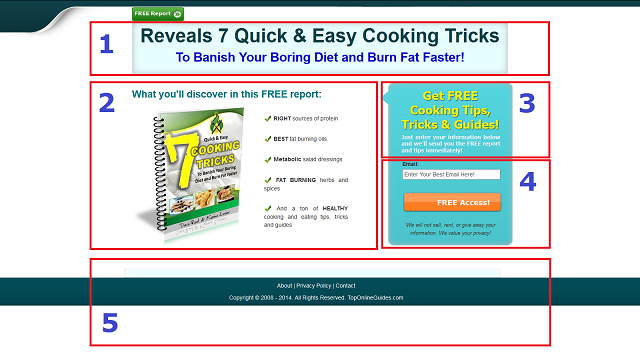
A Squeeze Page is actually a type of landing page where your visitors opt-in and become your subscribers by giving you their information including email address.
No matter if you are selling your own product or others’ on the Internet, a squeeze page is a must-have page on your website and you have to create a one if you have not done it yet.
Making a squeeze page may seem a little challenging due to copy writing and technical stuff. But, if you know some essential elements of an opt-in page, you can even create your own without any help. Remember you should have a list of targeted subscribers in order to get rapid results in online marketing. As they say: “The Money is in the List!”
5 Essential Elements Of a Squeeze Page
Here, I’ve illustrated the 5 essential elements of a squeeze page. You don’t need to be perfectionist in every single of them, but take some standards into account:

1. The Headline:
Perhaps, this is the most important element of your opt-in page where you catch the eye of your visitors, grab their attention and entice them to stay and subscribe.
What you need to tell is important in your headline, but how to tell it is also crucial since the first impression matters. Here are a few examples that may increase your opt-in rates:
- FREE Report Reveals:…
- Learn How I’ve Lost 25 Kg…
- Discover the Exact System I Use to…
- The Top 7 Tools I…
- Little Known Ways to…
2. Benefits:
After you succeed in making the first impression and keeping the visitor on the page for a longer time, you might lay out the benefits and answer their question: what’s in it for me?
- It could be an image of a free report or eBook you’re giving away plus a few benefits in bullet points stating clearly the advantages of subscription.
- It could be an audio that tells the main benefits and encourages the visitor to opt-in.
- It could also be a short video that shows the benefits of joining and ends with a call-to-action message.
Whatever it is, it should be short, straightforward and impressive. Remember you should match the benefits of your offer with your audience demand!
For example, if they are looking for some marriage advice and they stumble upon your opt-in page, your headline and benefit section should match each other and be relevant with the audience issue or need; something like “Discover How to Strengthen Your Relationship!”, not something like “Learn How To Become Healthy!”.
3. Call-To-Action:
The Call-To-Action (CTA) part is one of the most effective elements of a squeeze page, a place where you tell your visitor what to do. Bear in mind that human being needs to be instructed and guided to do something, and CTA in an opt-in page is the element that does the job and helps convert a visitor to a subscriber. Here are a few examples of a good call-to-action:
- Get FREE Tips, Tricks & Guides!
- Download the FREE Report Before It’s Gone!
- Grab Your FREE Copy of the…!
- Achieve Financial Freedom!
- Find Out More About the…!
Keep in mind that you might tell your visitors to enter their information such as name and email address in the form below! That way, you would increase your page conversion rate by an appealing call-to-action.
4. Opt-in Form:
It is the box where people enter their information and subscribe. This section should be big and visible combined with the Call-To-Action feature. Basically, the more field you put, the less conversion rate you’ll get because it requires more from the visitor. Bear in mind that the subscription should be fast and simple!
The opt-in form must be provided by your autoresponder which includes a specific code that takes care the technical job. However, you can add some fancy and create an attractive opt-in form.
The submit button is very crucial in this part and should include the Call-To-Action characteristic, too. Here are a few examples:
- Get FREE Instant Access!
- Count Me In!
- Let Me In Right Now!
- Send Me the Report Now!
- Download the Video Right Away!
5. Footer:
Last by not least, it is the footer section where you normally put some segments such as privacy policy, disclaimer and copyright notice. Here you can also add a link to your website about and contact pages as well. Just bear in mind that the footer is there just for legal purposes, so you don’t need to do something fancy here!
That’s it! The 5 essential elements of a squeeze page is briefly laid out. If you consider them while designing your own and implement them properly, you should be on your way to collecting email addresses and building a huge targeted and responsive list.
Secret Tip #1:
If you have noticed, the word “FREE” is very magical and you may use it as mush as possible in your copy including headline, benefits, CTA and submit button. It really helps your page boost its conversion rate.
Secret Tip #2:
I would personally recommend using WordPress for creating your squeeze pages. This simple WordPress plugin allows you to build unlimited number of high converting squeeze pages in just a few minutes.
Click here to check out the plugin right now!
What’s Next?!
Now after you have learned the 5 essential elements of a squeeze page, it’s your turn to get started and build your powerful opt-in page as soon as possible. If you want to become a successful web business owner, you should add email marketing to your promotional channel and build responsive email lists.


